Summary
Describes attributes control charts, a tool used in statistical process control. Part of the Performance Excellence in the Wood Products Industry publication series.
Introduction
Our focus for the prior publications in this series has been on introducing you to Statistical Process Control (SPC) — what it is, how and why it works, and how to use various tools to determine where to focus initial efforts to use SPC in your company.
SPC is most effective when focused on a few key areas as opposed to measuring anything and everything. With that in mind, we described how to:
- Use Pareto analysis and check sheets to select projects (Part 3).
- Construct flowcharts to build consensus on the steps involved and help define where quality problems might be occurring (Part 4).
- Create cause-and-effect diagrams to identify potential causes of a problem (Part 5).
- Design experiments to hone in on the true cause of the problem (Part 6).
- Use the primary SPC tool — control charts — for day-to-day monitoring of key process variables to ensure the process remains stable and predictable over time (Part 7).
Variables control charts are useful for monitoring variables data — things you measure and express with numbers, such as length, thickness, moisture content, glue viscosity and density. However, not all quality characteristics can be expressed this way. Sometimes, quality checks are simply acceptable/unacceptable or go/no-go. For these situations, we need to use attributes control charts.
It is important, however, to not lose sight of the primary goal: Improve quality, and in so doing, improve customer satisfaction and the company’s profitability.
How can we be sure our process stays stable through time?
In an example that continues throughout this series, a quality improvement team from XYZ Forest Products Inc. (a fictional company) determined that size out of specification for wooden handles (hereafter called out-of-spec handles) was the most frequent and costly quality problem. The team identified the process steps where problems may occur, brainstormed potential causes, and conducted an experiment to determine how specific process variables (wood moisture content, species and tooling) influenced the problem.
The team’s experiment revealed that moisture content as well as an interaction between wood species and tooling affect the number of out-of-spec handles. They began monitoring moisture content. Because moisture content data are variables data, the team constructed and interpreted these data with X-bar and R control charts.
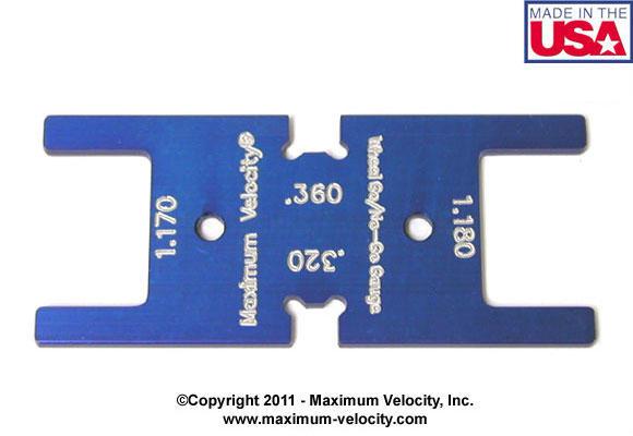
What if the team instead chooses to monitor data such as handle dimensions, as they were doing when they initially identified the problem? They could measure handles with a custom measuring device that has machined dimensions for the upper and lower limits for acceptable handle specifications. If the handle is too large to pass through the device at the upper limit or small enough to pass through the device at the lower limit, it is considered out of spec. This type of device is commonly known as a go/no-go gauge (Figure 1).
Instead of taking a sample of five handles and obtaining moisture content data (e.g., values of 6.5%, 7.1%, etc.), the team might take a sample of 50 handles every few hours, check them with a go/no-go gauge and discover that five are out of spec. This type of data is not suitable for variables control charts, but the team still needs to analyze the data and determine whether variability in the process is within the expected range. For this situation, an attributes control chart is the tool to use.
Attributes control charts
There are several types of attributes control charts:
- p charts: for fraction nonconforming in a sample; sample size may vary.
- np charts: for number nonconforming in a sample; sample size must be the same.
- u charts: for count of nonconformities in a unit (e.g., a cabinet or piece of furniture); number of units evaluated in a sample may vary.
- c charts: for count of nonconformities in a unit; number of units evaluated in a sample must be the same.
Of these chart types, the p chart is the most common in the wood products industry. Therefore, this publication focuses on how to construct and interpret p charts. See the resources listed in the “For more information” section at the end of this publication for details on the other chart types.
Like variables control charts, attributes control charts are graphs that display the value of a process variable over time. For example, we might measure the number of out-of-spec handles in a batch of 50 items at 8 a.m. and plot the fraction nonconforming on a chart. We would then repeat the process at regular time intervals. Attributes control charts include points (in this case, the fraction nonconforming in a sample), a centerline that represents the overall average of the variable being monitored, and upper and lower limits known as control limits.
Many details about using p charts are identical to what we described in Part 7 for variables control charts. So let’s return to our example and see how the XYZ team constructed and interpreted a p chart.
Example: XYZ Forest Products Inc. uses an attributes control chart
Collect data
Previously, the quality improvement team at XYZ Forest Products Inc. designed an experiment and used a go/no-go gauge to measure size out of specification for batches of 50 handles made with all combinations of poplar and birch at 6% and 12% moisture content, and with existing and new tooling. Each combination was run five times (five replicates). That amounts to eight combinations of species, moisture content, and tooling and 40 batches (2,000 handles!). Table 1 repeats the results of that experiment.
Can the team use these data to create a p chart? Certainly. However, in practice, we need another critical piece of information: order of production. Remember that control charts are intended to display the results of samples taken from a production process as they are being produced.
Because good experimental design calls for randomizing the sequence of the runs, the results in Table 1 are probably not in sequence. But for the sake of this discussion, we will assume the data are in sequence (that is, batch 1 was run at 8 a.m., batch 2 at 9 a.m., and so on).
Note: If the outcome could be affected as a result of timing or sequence of runs (such as dulling of the tool), differences in results between early and late batches are likely to be due to timing as much as to the variables being tested. Therefore, it is good practice in experimentation to randomize the order of the runs.
| Batch | MC (%)1* | Tooling | Species | Out-of-spec (no.) | Batch | MC (%)1* | Tooling | Species | Out-of-spec (no.) |
|---|---|---|---|---|---|---|---|---|---|
| 1 | 6 | existing | birch | 5 | 21 | 12 | existing | birch | 8 |
| 2 | 6 | existing | birch | 6 | 22 | 12 | existing | birch | 7 |
| 3 | 6 | existing | birch | 5 | 23 | 12 | existing | birch | 6 |
| 4 | 6 | existing | birch | 4 | 24 | 12 | existing | birch | 7 |
| 5 | 6 | existing | birch | 5 | 25 | 12 | existing | birch | 9 |
| 6 | 6 | existing | poplar | 4 | 26 | 12 | existing | poplar | 6 |
| 7 | 6 | existing | poplar | 6 | 27 | 12 | existing | poplar | 5 |
| 8 | 6 | existing | poplar | 3 | 28 | 12 | existing | poplar | 6 |
| 9 | 6 | existing | poplar | 2 | 29 | 12 | existing | poplar | 7 |
| 10 | 6 | existing | poplar | 4 | 30 | 12 | existing | poplar | 8 |
| 11 | 6 | new | birch | 4 | 31 | 12 | new | birch | 8 |
| 12 | 6 | new | birch | 6 | 32 | 12 | new | birch | 7 |
| 13 | 6 | new | birch | 6 | 33 | 12 | new | birch | 9 |
| 14 | 6 | new | birch | 7 | 34 | 12 | new | birch | 8 |
| 15 | 6 | new | birch | 5 | 35 | 12 | new | birch | 9 |
| 16 | 6 | new | poplar | 4 | 36 | 12 | new | poplar | 5 |
| 17 | 6 | new | poplar | 3 | 37 | 12 | new | poplar | 4 |
| 18 | 6 | new | poplar | 2 | 38 | 12 | new | poplar | 4 |
| 19 | 6 | new | poplar | 2 | 39 | 12 | new | poplar | 3 |
| 20 | 6 | new | poplar | 4 | 40 | 12 | new | poplar | 3 |
*Moisture content
Analyze data
Data analysis for p charts is simpler than that for variables control charts. For each sample, we simply need to calculate p (the fraction nonconforming in the sample) by dividing the number nonconforming in the sample by the sample size.
For batch 1, this is: 5/50 = 0.1 (10%)
For variables control charts, we use one chart to monitor the average (X-bar chart) and another to monitor the variability (range or R chart). There is only one chart for p charts.
As with variables control charts, we plot data on a p chart with a centerline and control limits that are plus and minus three standard deviations from the average. The centerline is the average rate of nonconforming product. The average fraction nonconforming on a p chart is represented by the symbol p (p bar). In our XYZ example, there were 216 nonconforming (out-of-spec) handles out of 2,000 measured.
p = 216/2000 = 0.108 (10.8%)
This means that size was out of specification for about 10.8% of samples. Now, we need to estimate the standard deviation of p to calculate the control limits.
Calculate control limits
In Part 7, we discussed the normal distribution for variables control charts in detail. For p charts, the underlying statistical distribution is known as the binomial distribution. The binomial distribution is the probability distribution of the number of successes in a sequence of independent conforming/nonconforming (yes/no) experiments, each of which yields success with probability p.
From statistical theory, we know that the standard deviation (s.d.) of a binomial variable p is:
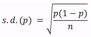
where n is the sample size (50 in this example). Therefore, the three-standard-deviation control limits for a p chart are:
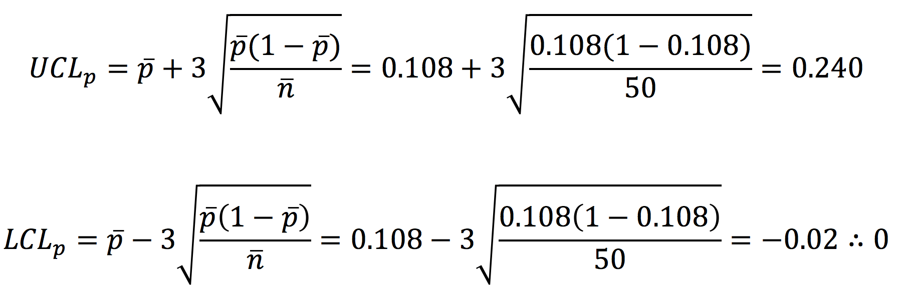
where n is the average sample size (50 for this example, since all the batches were of size 50). Therefore, the centerline is 0.108 (the average fraction nonconforming of all the samples). The upper control limit is 0.240. Since the lower control limit is negative, it is set to zero (the cluster of three dots at the end means “therefore”).
Construct and interpret p chart
Construct p chart
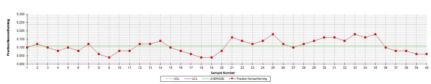
Figure 2 shows the p chart for the data in Table 1. Now we need to decide what the chart means and what it can tell us about the process. Remember: Our primary interest is process stability and consistency.
In Part 7, we discussed common-cause and assignable-cause variability. Common-cause variability is inherent to the process. Assignable-cause variability is an indication that something has changed. We use control charts to decide which type of variability is present.
If there is evidence of only common-cause variability, we may conclude that the process is in control (stable). However, if there is evidence of assignable-cause variability, we conclude that the process is out of control (unstable). If the process is out of control, we must take action to return stability to the process.
What are the indicators of assignable-cause variability? As with variables control charts, a point beyond the control limits is a first-level indicator and a sign that we should take action. Other indicators of an out-of-control process are known as the Western Electric Rules because they were developed by the Western Electric Company and published in its Statistical Quality Control Handbook (1956). These rules are summarized in Table 2. The rules for p charts are different than those for X-bar and R charts because the charts have different underlying statistical distributions (binomial distribution and normal distribution, respectively).
Examine p chart
Look again at Figure 2. There are no points beyond the upper control limit. Therefore, Rule 1 is not violated. In fact, none of the four rules listed in Table 2 are violated — although we come very close. For example, beginning at Sample 28 there are eight points in a row above the centerline. And there are several places with five points steadily increasing or decreasing (and the sixth point is often the same as the fifth).
Therefore, the XYZ team should proceed with caution before assuming this process is in control.
Interpret p chart
At this point, we must stop and consider the nature of these data. Remember: These data are from experimental runs. The team deliberately varied the species, moisture content and tooling. Therefore, we should expect this process to be in control only if there are no significant effects due to species, moisture content and tooling.
But during the designed experiment, there was statistical evidence of a difference in the number of out-of-spec handles due to moisture content and an interaction between species and tooling. In other words, the designed experiment revealed that this is not a stable, consistent process. Therefore, we should expect some evidence of instability (out of control) to appear on the p chart.
So why don’t we see strong evidence of lack of control? One reason is that the differences are not dramatic. Also, p charts aren’t very sensitive unless sample sizes are very large, the nonconforming rate is high or both.
One important note: Remember that these are fractions nonconforming in a sample. If the process goes out of control above the upper control limit, that is an indication that the defect rate has increased. But what if the process is out of control on the low side? For example, what if there are nine or more points in a row below the centerline or the lower control limit is below zero (the lower limit)? This is actually a good thing! It indicates that the defect rate has decreased. Either way, we must investigate to determine the cause. For an increasing defect rate, we need to identify and correct problems. For a decreasing rate, we need to determine what went right and how to sustain this improvement.
The np attributes control chart
The np chart is another type of attributes control chart. The main difference between the np chart and p chart is the rules regarding sample size. For np charts, the sample size of each subgroup must be the same.
This situation is applicable to the data in the XYZ example. The batch size was 50 for all 40 samples. So we could plot data from Table 1 on an np chart. The np chart would look identical to the p chart, and the interpretation would be identical as well.
The main difference would be in the scale. Rather than plotting the fraction nonconforming, we would plot the number nonconforming (np). The centerline would be the average number of nonconforming items over the 40 batches (5.4, in this case). The formulas for control limits on np charts are similar to those for p charts:
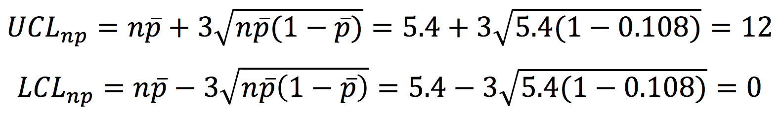
On an np chart for the data in Table 1, the upper control limit would be 12. As with the p chart, the lower control limit would be zero.
Next steps
Once the process exhibits control (on a variables control chart, attributes control chart or both) for a reasonable amount of time, can the XYZ team be confident that the size-out-of-spec problem will go away? Unfortunately, it’s not that simple.
When analyzing a p chart, what is an acceptable level of nonconforming items? Isn’t a single out-of-spec handle one too many? As the team starts considering acceptable quality levels and determining how the process variability compares with customer expectations, they must shift out of the domain of control charts.
Control charts help determine whether processes are stable and if so, at what target value and variability. To compare processes to customer expectations (specifications), the XYZ team will need to turn its attention from process stability to process capability.
The next publication (Part 9) in this series will focus on another area of SPC: process capability analysis.
Where to use attributes control charts
In your company, where could you use attributes control charts? Any area where you are doing some type of inspection and making good/bad or yes/no decisions is a candidate. Common examples in the wood products industry include:
- Packaging: Correct label placement, correct label details (e.g., if the package says ¾" oak, is it really ¾" oak?), legible label, correct number and placement of bands on a unit.
- Sticker placement: For dry kiln operations, kiln stickers are the pieces of wood (often about the size of a 1×2) that are placed between layers of lumber to allow for airflow in the kiln. Some companies use p charts to track correct placement and alignment of the stickers. Procedure: Hold up a straightedge to cover the stickers and count the number of stickers not covered by the straight edge (i.e., those that are out of alignment) as well as those that are missing altogether.
- Finished unit inspection: For items such as cabinets and furniture, companies often do a final inspection of the appearance of the finish, placement of hardware, presence/absence of additional hardware and correct placement of protective corner blocks. A c chart or u chart may also be appropriate in these situations when there are multiple items inspected on a single unit (i.e., cabinet or table).
For more information
The Oregon Wood Innovation Center website provides common table values for SPC: http://owic.oregonstate.edu/spc.
The listing for this publication in the OSU Extension Catalog also includes a supplemental spreadsheet file that includes the data and chart from this publication: https://catalog.extension.oregonstate.edu/em9110.
Brassard, M., and D. Ritter. 2010. The Memory Jogger II: A Pocket Guide of Tools for Continuous Improvement & Effective Planning. Methuen, MA: Goal/QPC. http://www.goalqpc.com
Grant, E.L., and R.S. Leavenworth. 1996. Statistical Quality Control (7th edition). New York, NY: McGraw-Hill.
Montgomery, D.C. 2012. An Introduction to Statistical Quality Control (7th edition). New York, NY: John Wiley & Sons.
Western Electric Company Inc. 1956. Statistical Quality Control Handbook. Milwaukee, WI: Quality Press.
About this series
Publications in the Performance Excellence in the Wood Products Industry series address topics related to wood technology, marketing and business management, production management, quality and process control, and operations research.
For a complete list of titles, visit the Oregon State University Extension Catalog and search for “performance excellence”: https://catalog.extension.oregonstate.edu/.


