Summary
Describes how to use Pareto analysis to identify and prioritize quality control problems in a manufacturing environment. Includes how to identify nonconformities, their frequency, and their impacts.
Part of the Performance Excellence in the Wood Products Industry publication series.
Part 1 in this series introduced the reader to Statistical Process Control, and Part 2 provided an overview of how and why SPC works. Part 3 begins the step-by-step process of building the practical skills necessary for hands-on implementation of SPC. This report discusses Pareto analysis, a tool we can use to help decide how and where to begin using SPC. We also discuss check sheets, which are data collection tools that may be used in Pareto analysis.
Part 4 discusses flowcharts. Other publications in the series discuss case histories of wood products firms using SPC, providing real-world evidence of the benefits of SPC and examining pitfalls and successful approaches.
Where to begin an SPC program?
Most manufacturing processes are sufficiently complex that at first glance it may seem impossible to decide where to begin using SPC techniques. SPC programs that attempt to monitor too many process variables are quickly overwhelmed by the time and labor required to collect, analyze, plot and interpret the data. In such cases, SPC seems too time consuming and expensive to be of any benefit.
The life expectancy of SPC in a company depends heavily on the results of the first few projects undertaken. With this kind of pressure, how do you decide where to begin?
Obviously, we cannot measure everything. We must focus initially on the most important quality problems to get the “biggest bang for the buck.” This is especially true in the early stages of an SPC program when personnel are likely to be skeptical of SPC and hesitant to make the necessary changes.
Prioritizing quality problems for the company is a good first step. Then, determine which projects will have the highest return on investment and therefore should be the initial focus of quality improvement programs. Pareto analysis enables us to do all this.
Pareto analysis
Pareto (pronounced “pah-RAY-toe”) analysis uses the Pareto principle, also called the 80:20 rule, to analyze and display data. Vilfredo Pareto was a 19th-century Italian economist who studied the distribution of income in Italy. He found that about 20% of the population controlled about 80% of the wealth.
Quality expert J.M. Juran applied the principle to quality control and found that 80% of problems stem from 20% of the possible causes. The numbers 80 and 20 are not meant to be absolutes. The main point, as Juran stated, is that we should focus on the “vital few” problems (those in the 20% category) rather than on the “trivial many” to make the most significant improvements in product quality.
Pareto charts are the graphical tool used in Pareto analysis. A Pareto chart is a bar chart that displays the relative importance of problems in a format that is very easy to interpret. The most important problem (for example, the one highest in cost, frequency, or some other measurement) is represented by the tallest bar, the next most important problem is represented by the next tallest bar, and so on. A check sheet is a useful tool for collecting data for Pareto charts.
Check sheets
Check sheets are relatively simple forms used to collect data. They include a list of nonconformities and a tally of nonconformities. Check sheets should also include the name of the project for which data is being collected, the shift when the items were produced, the names of persons collecting the data, dates of data collection and of production (if known), and the location of data collection (e.g., in-house or at a customer’s).
Check sheets aren’t mandatory to construct Pareto charts. However, because check sheets require you to standardize your list and definitions of nonconformities, they provide several benefits.
First, people often do not agree on the major categories of nonconformities. Therefore, developing a list of common nonconformities (i.e., quality problems) is not as easy as it sounds. A good way to develop this list is to brainstorm with production personnel, management, QC personnel, and, most important, your customers.
Second, people often do not agree on precisely what constitutes “nonconforming.” In other words, how bad does it have to be to get thrown in the scrap or rework pile?
Last, different people often will put a given item in different categories. For example, one person may call an item with torn grain a machining defect, another might call it fuzzy grain, and another may call it reaction wood. Without standard terminology and definitions, it becomes very difficult to conduct a Pareto analysis.
To get an idea of the effect on your company of lack of standardized terminology and definitions for nonconformities, try a simple experiment. Select several items at random and ask different people to examine them and record nonconformities item by item.
One experiment at a secondary wood products manufacturer involved five quality inspectors. The inspectors did not agree on the number of items that should be rejected due to quality problems (the scrap/rework rate varied from 34% to 49%) nor did they agree on the reasons for rejecting the products. Had we looked only at data collected by inspectors 1, 2 and 3, we would have concluded that torn grain and blue stain were the biggest quality problems. Had we looked only at data collected by inspectors 4 and 5, we would have concluded that dents (handling damage) and reaction wood were the biggest quality problems. Do not underestimate the importance of developing a standard list of nonconformities and precise definitions for each.
The following example demonstrates how to construct and interpret check sheets and Pareto charts.
Example
The Quality Improvement Team at a manufacturer of wood components visited a customer and examined items in the scrap and rework bins. After looking at each item and talking with the customer, the team agreed on categories of nonconformities and developed precise definitions for each category. They created a check sheet, then inspected each item and tallied the number of occurrences (frequency) for each cause of nonconformity. Figure 1 presents the results.
| Project: Quality improvement project. Name: QIT. Location: Customer A. Dates: January 2002. Shift: All. | ||
|---|---|---|
| Reason | Frequency | |
| Size out of specification | IIII/ IIII/ IIII/ IIII/ IIII/ IIII/ IIII/ IIII/ IIII/ IIII/ IIII/ IIII/ IIII/ IIII/ IIII/ IIII/ IIII/ IIII/ IIII/ IIII/ IIII/ IIII/ IIII/ IIII/ IIII/ IIII/ IIII/ IIII/ IIII/ IIII/ IIII/ IIII/ IIII/ IIII/ IIII/ IIII/ IIII/ IIII/ IIII | 194 |
| Loose knots | IIII/ IIII/ IIII/ III | 18 |
| Raised grain | IIII | 4 |
| Dents | III | 3 |
| Stain/rot | IIII/ IIII/ IIII/ IIII/ IIII/ IIII/ I | 31 |
| Fuzzy grain | IIII/ IIII/ IIII/ IIII/ IIII/ IIII/ IIII/ IIII/ IIII/ IIII/ IIII/ IIII/ IIII/ IIII/ IIII/ IIII/ IIII/ IIII/ IIII/ IIII/ IIII/ | 105 |
| Splits | IIII/ IIII/ I | 11 |
| Machine tear-out | IIII/ IIII/ IIII/ IIII/ IIII/ IIII/ IIII/ IIII/ IIII/ IIII/ IIII/ IIII/ I | 61 |
| Burn marks | IIII/ IIII/ IIII/ IIII/ IIII/ IIII/ IIII/ IIII/ IIII | 44 |
| Oil/grease marks | II | 2 |
| Total | 473 | |
Nonconformities were sorted from highest to lowest frequency, and the relative frequency for each was determined (Figure 2). For example, “size out-of-specification” was 194 out of 473 nonconformities, and so the relative frequency for size-out-of specification was:
194/473 = 0.41 = 41%
An optional final step is to calculate cumulative relative frequency. Cumulative relative frequency helps the user to readily see the combined effect of the “vital few” problems. For example, you could see that the top three quality problems were responsible for nearly 80% of the problems overall. To calculate cumulative relative frequency, add the relative frequency for each category of nonconformity to the sum of all preceding relative frequencies.
For example, there were 194 occurrences of size out-of-specification or 41% (relative frequency) of the total. There were 105 occurrences of fuzzy grain. Fuzzy grain was therefore responsible for 22% of the total. Size out-of-specification and fuzzy grain combined (cumulative relative frequency) were responsible for 63% of the total. Size out-of-specification, fuzzy grain, and machine tear-out combined were responsible for 76% of the total. The cumulative relative frequency for the least frequent category (oil/grease marks, in this example) should be 100%; however, it is slightly less due to rounding. Figure 2 shows the check sheet with the nonconformities arranged in descending order of frequency and with relative frequency and cumulative relative frequency calculated.
| Project: Quality improvement project. Name: QIT. Location: Customer A. Dates: January 2002. Shift: All | ||||
|---|---|---|---|---|
| Reason | Frequency | Rel. Freq. (%) | Cum. Rel. Freq. (%) | |
| Size out of specification | IIII/ IIII/ IIII/ IIII/ IIII/ IIII/ IIII/ IIII/ IIII/ IIII/ IIII/ IIII/ IIII/ IIII/ IIII/ IIII/ IIII/ IIII/ IIII/ IIII/ IIII/ IIII/ IIII/ IIII/ IIII/ IIII/ IIII/ IIII/ IIII/ IIII/ IIII/ IIII/ IIII/ IIII/ IIII/ IIII/ IIII/ IIII/ IIII | 194 | 41 | 41 |
| Fuzzy grain | IIII/ IIII/ IIII/ IIII/ IIII/ IIII/ IIII/ IIII/ IIII/ IIII/ IIII/ IIII/ IIII/ IIII/ IIII/ IIII/ IIII/ IIII/ IIII/ IIII/ IIII/ | 105 | 22 | 63 |
| Machine tear-out | IIII/ IIII/ IIII/ IIII/ IIII/ IIII/ IIII/ IIII/ IIII/ IIII/ IIII/ IIII/ I | 61 | 13 | 76 |
| Burn marks | IIII/ IIII/ IIII/ IIII/ IIII/ IIII/ IIII/ IIII/ IIII | 44 | 9 | 85 |
| Stain/rot | IIII/ IIII/ IIII/ IIII/ IIII/ IIII/ I | 31 | 7 | 92 |
| Loose knots | IIII/ IIII/ IIII/ III | 18 | 4 | 96 |
| Splits | IIII/ IIII/ I | 11 | 2 | 98 |
| Raised grain | IIII | 4 | 0.8 | 98.8 |
| Dents | III | 3 | 0.6 | 99.4 |
| Oil/grease marks | II | 2 | 0.4 | 99.8 |
| Total | 473 | 99.8 | ||
Figure 3 is the Pareto chart for the data in Figure 2. The left vertical axis indicates the number (frequency) of each type of nonconformity. Always plot nonconformities in descending order of frequency, with the most frequent at the left vertical axis. The right axis indicates cumulative frequency.
The Pareto chart makes it easy to see that size out-of-specification, fuzzy grain, and machine tear-out are the major nonconformities. Quality improvement that focuses on these items will give the “biggest bang for the buck.”
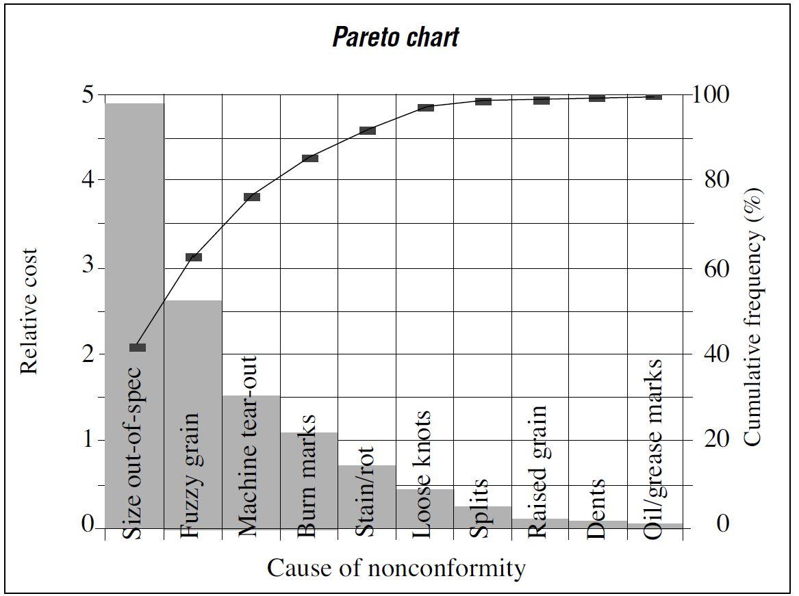
Frequency, however, is not the only important consideration. Certain types of nonconformities, even if infrequent, may be very costly to scrap or rework. Therefore, the Pareto analysis should take into account both cost and frequency.
Though scrap and rework often involve very different costs, it’s possible to calculate an average scrap and rework cost based on the percentage of product in each category of nonconformity. For example, let’s say we estimate that 10% of material with size out-of-specification must be scrapped, but the remaining 90% can be reworked to produce a usable product. Further, let’s say that scrapping the product represents a loss of approximately $20 per item, and reworking costs approximately $11 per item. Therefore, our estimate of the average scrap and rework cost for size out-of-specification is:
(scrap cost) x (% scrap) + (rework cost) x (% rework) = scrap & rework cost
($20) x (10%) + ($11) x (90%) = $12
To account for frequency as well as scrap and rework costs, multiply relative frequency by cost to obtain relative cost. For example, we already determined that approximately 41% of nonconformities were size out-of-specification. Therefore, the relative cost due to size out-of-specification is:
0.41 x $12 = $4.92
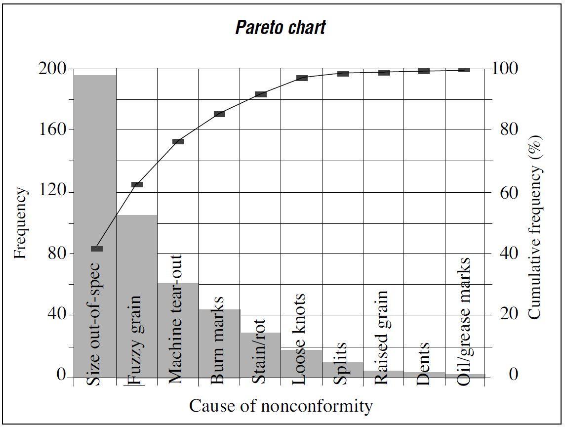
Table 1 shows the relative costs, and Figure 4 shows the corresponding Pareto chart. We can see that size out-of-specification is the primary nonconformity from the standpoint of frequency (Figure 3) as well as relative cost to scrap or rework (Figure 4). Therefore, to get the “biggest bang for the buck,” it would be wise to begin the SPC program by focusing on problems that lead to size out-of-specification.
| Nonconformity | Rel. Cost ($) | Rel. Freq. (%) | Cum. Rel. Freq. (%) |
|---|---|---|---|
| Size out-of-spec. | 4.92 | 38 | 38 |
| Machine tear-out | 2.34 | 18 | 56 |
| Fuzzy grain | 1.76 | 13 | 69 |
| Stain/rot | 1.75 | 13 | 82 |
| Loose knots | 1.00 | 8 | 90 |
| Burn marks | 0.72 | 6 | 96 |
| Splits | 0.32 | 2 | 98 |
| Dents | 0.09 | 0.7 | 98.7 |
| Raised grain | 0.06 | 0.5 | 99.2 |
| Oil/grease marks | 0.03 | 0.2 | 99.4 |
| Total | 12.99 | 99.4 |
Summary
We now know the primary nonconformities and therefore where to focus initial efforts of an SPC program. We do not yet know, however, the specific processing steps that lead to a given nonconformity—that is, where and how the problem arises—and therefore we do not yet know where or what to monitor.
To help us discover the specific steps in the process that lead to a given nonconformity, it is helpful to develop a flowchart for the process. Flowcharts are the subject of the next report in this series.
For more information
Brassard, M., and D. Ritter. 1994. The Memory Jogger II: A Pocket Guide of Tools for Continuous Improvement & Effective Planning. Salem, NH: Goal/QPC. http://www.goalqpc.com/
Grant, E.L., and R.S. Leavenworth. 1988. Statistical Quality Control, 6th ed. New York, NY: McGraw Hill.
Ishikawa, K. 1982. Guide to Quality Control. Tokyo, Japan: Asian Productivity Organization.
Montgomery, D.C. 1997. Introduction to Statistical Quality Control, 3rd ed. New York, NY: John Wiley & Sons.
Walton, M. 1986. The Deming Management Method. New York, NY: Putnam.
About this series
Publications in the Performance Excellence in the Wood Products Industry series address topics related to wood technology, marketing and business management, production management, quality and process control, and operations research.
For a complete list of titles, visit the Oregon State University Extension Catalog and search for “performance excellence”: https://catalog.extension.oregonstate.edu/